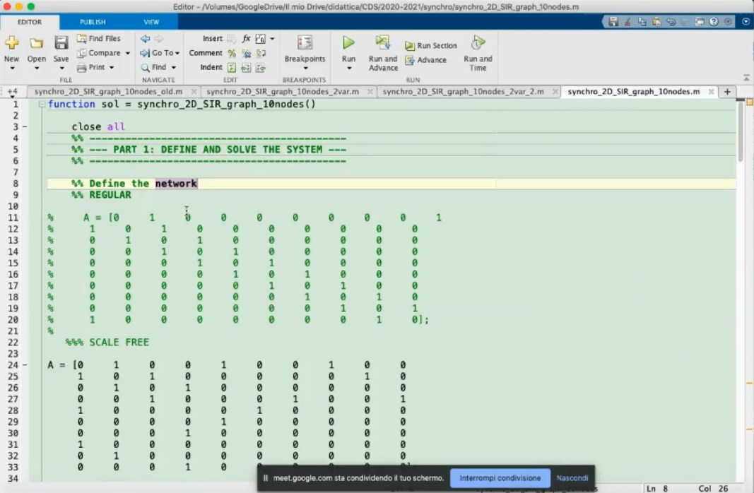
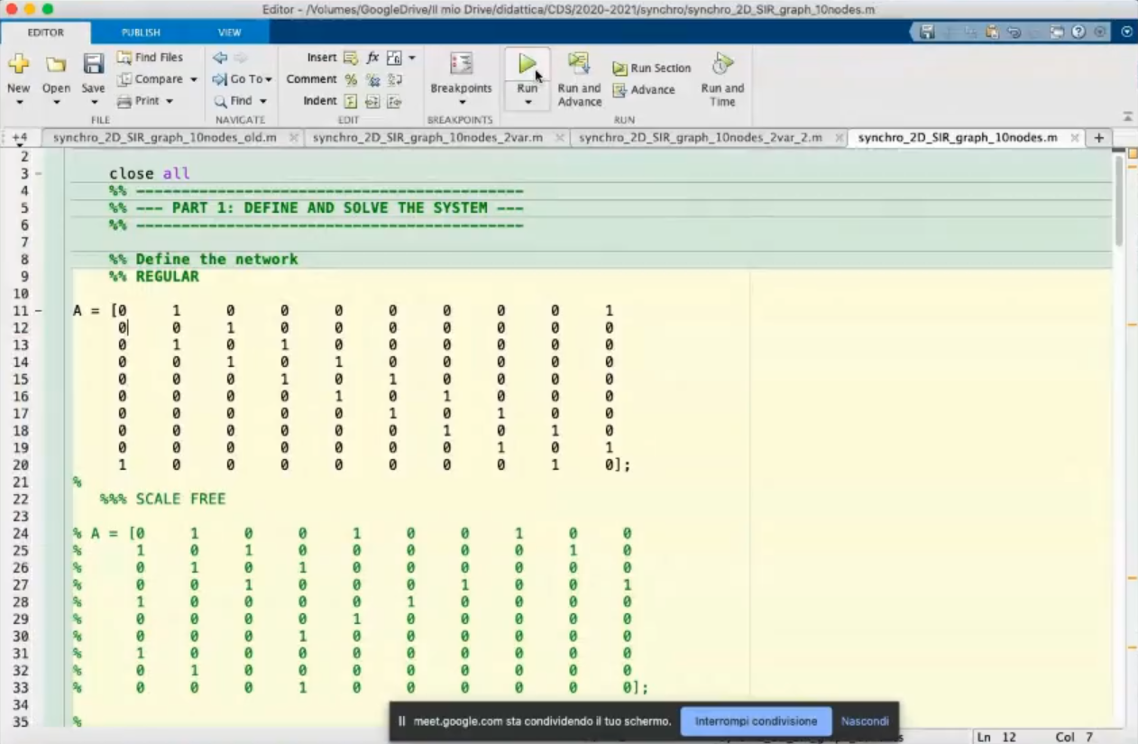
- Here we define the graph structure.
- Represents the SRI model, consider each node like an itialian region.
- The connections can be seen as the roads that connect one region to another.
- We will see how by reducing the “strenght” of the connections we can reduce the number of infected.
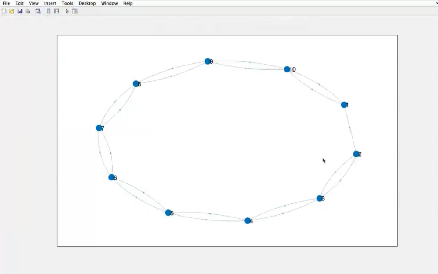
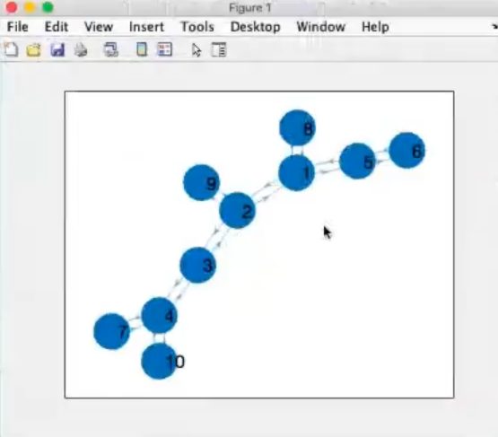
- Graph
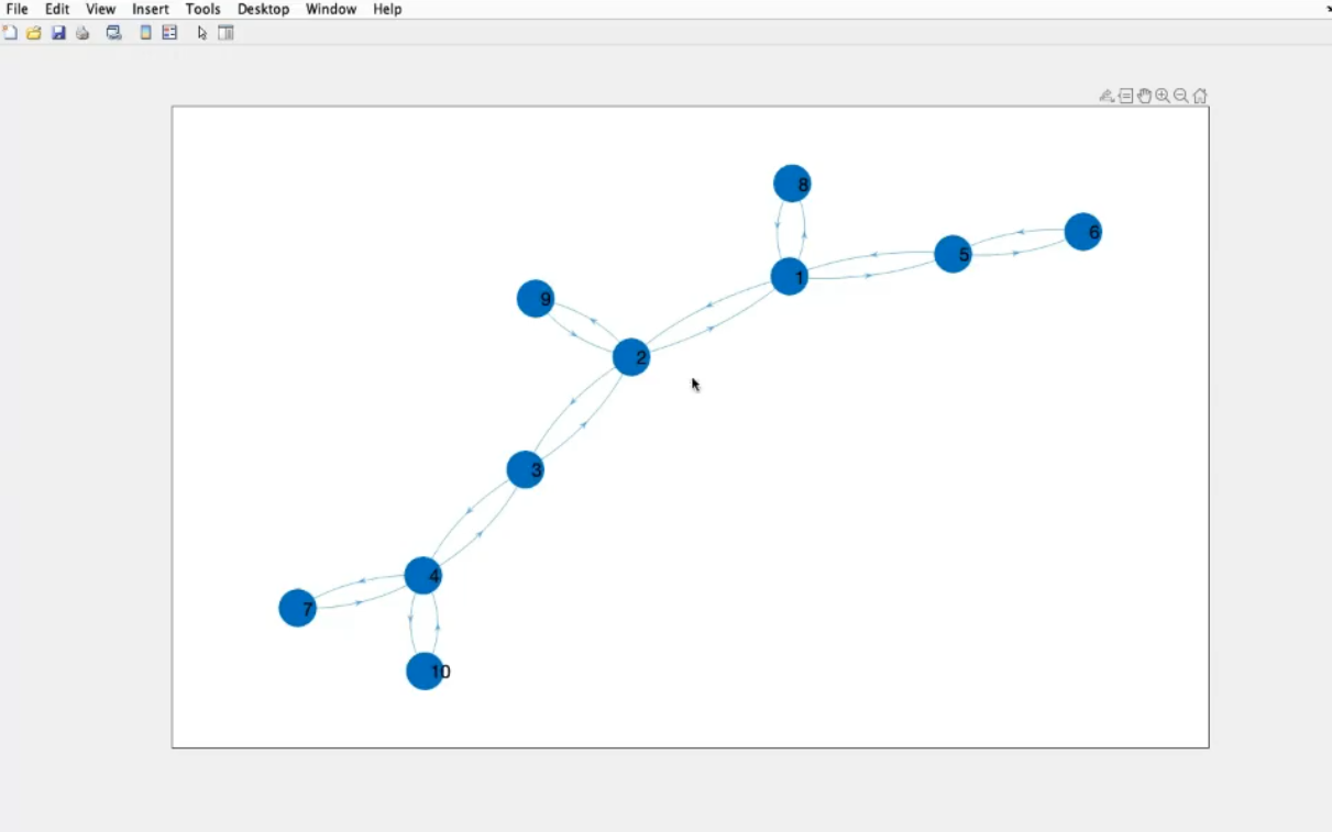
- The ending part of the graph are called leaf, they are connected to only one other node.
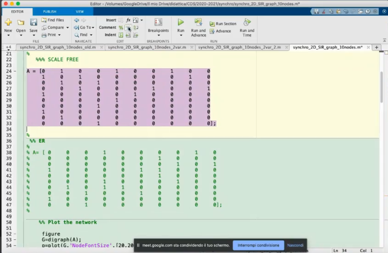
- This is a non regular graph, it is a random graph or “scale free graph”.
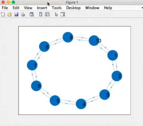
- We change the graph structure
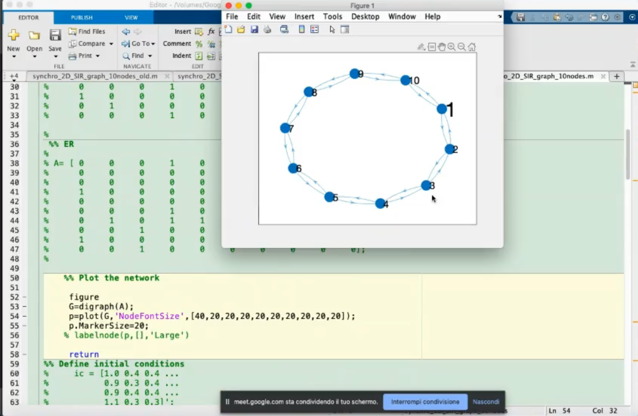
- Graph
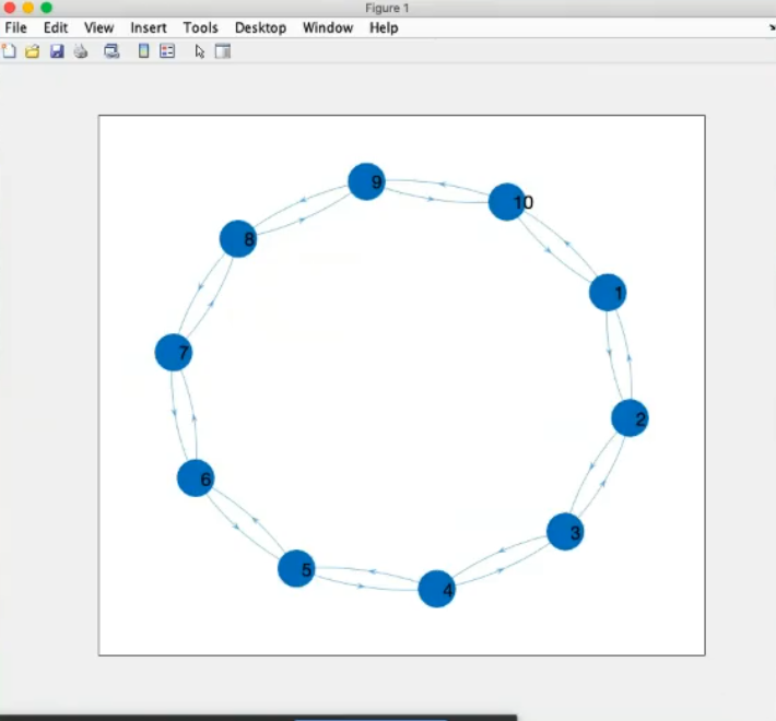
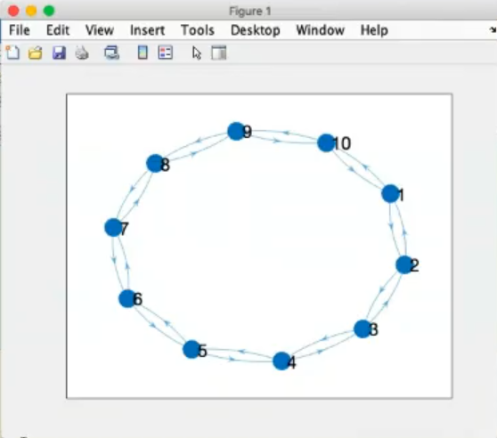
- This is a regular graph, because all nodes have the same number of connection, we can also be more clear defining this graph as a regular graph of degree 2.
(All nodes have 2 connections).
- These graphs can all be considered undirected, each connection has a “counterpart”
~Ex.: Node 4 is connected to node 5, but node 5 is also connected to node 4, this is true for all nodes.
More precisely: “a graph is defined as undirected if the “matrix structure” A, is symmetric.”
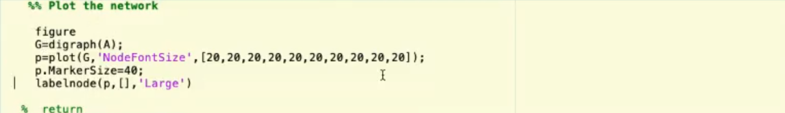
- Code for plotting the network.
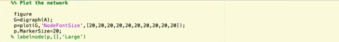
- Changing the code slightly, here are the changes:
- Also the
labelnode(p,[],'Large') is not useful.
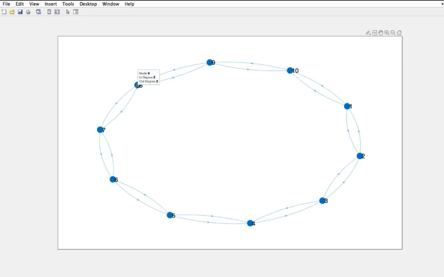
- If we move the mouse to a node we can see it’s “name” (
node: 8).
- The In Degree (number of “arriving” connections)
- The Out Degree (number of “exiting” connections)
- An undirected graph has always same number of in and out degree for each node.
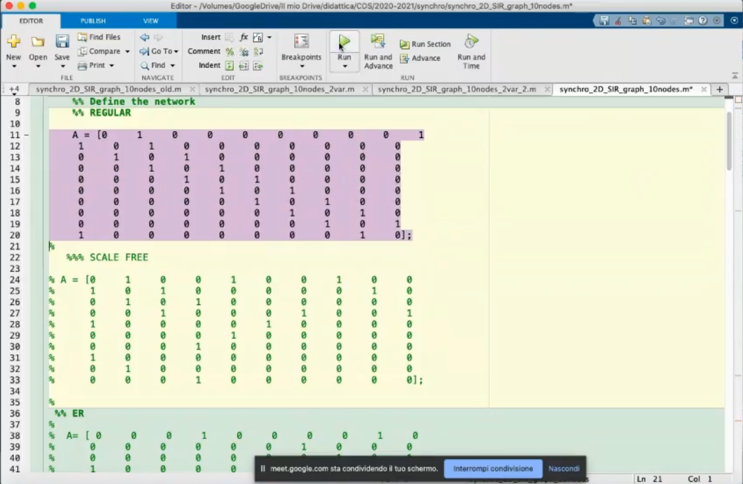
- Minor change to the network.
- The A matrix is no longer symmetric.
- The graph now is directed (see nodes
1 and 2)
- For our case (SRI - covid in italy) we would need an undirected graph, but with different strenght of connections, since an itialian region can be in “lockdown” and there can be almost no connections to other regions.
- If we change the
'NodeFontSize' (the first element is now 40)
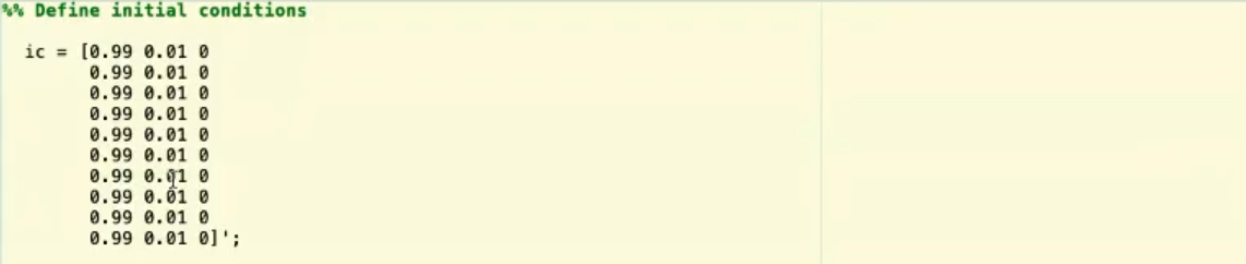
- The initial conditions, in this SRI model they represents:
- The susceptible
- The infected
- The removed (cured+dead)
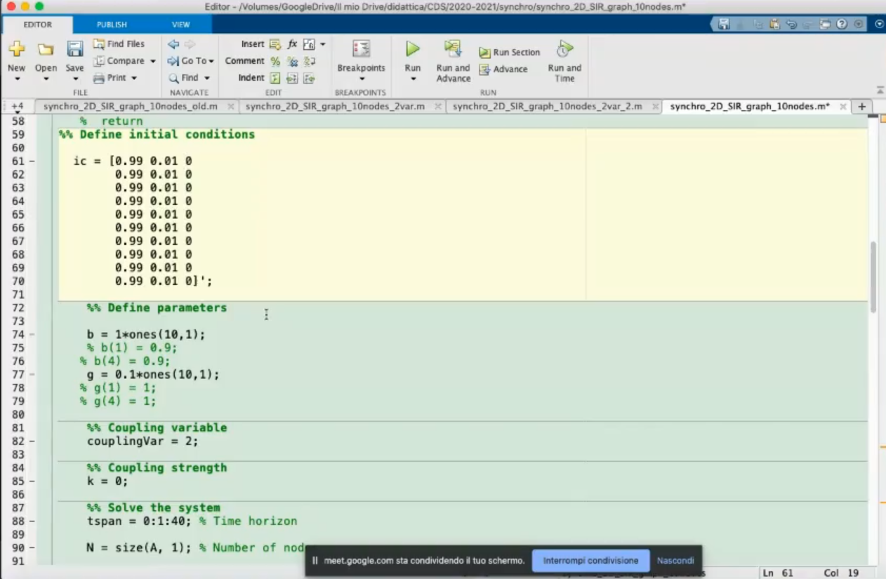
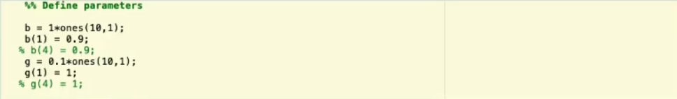
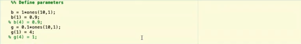
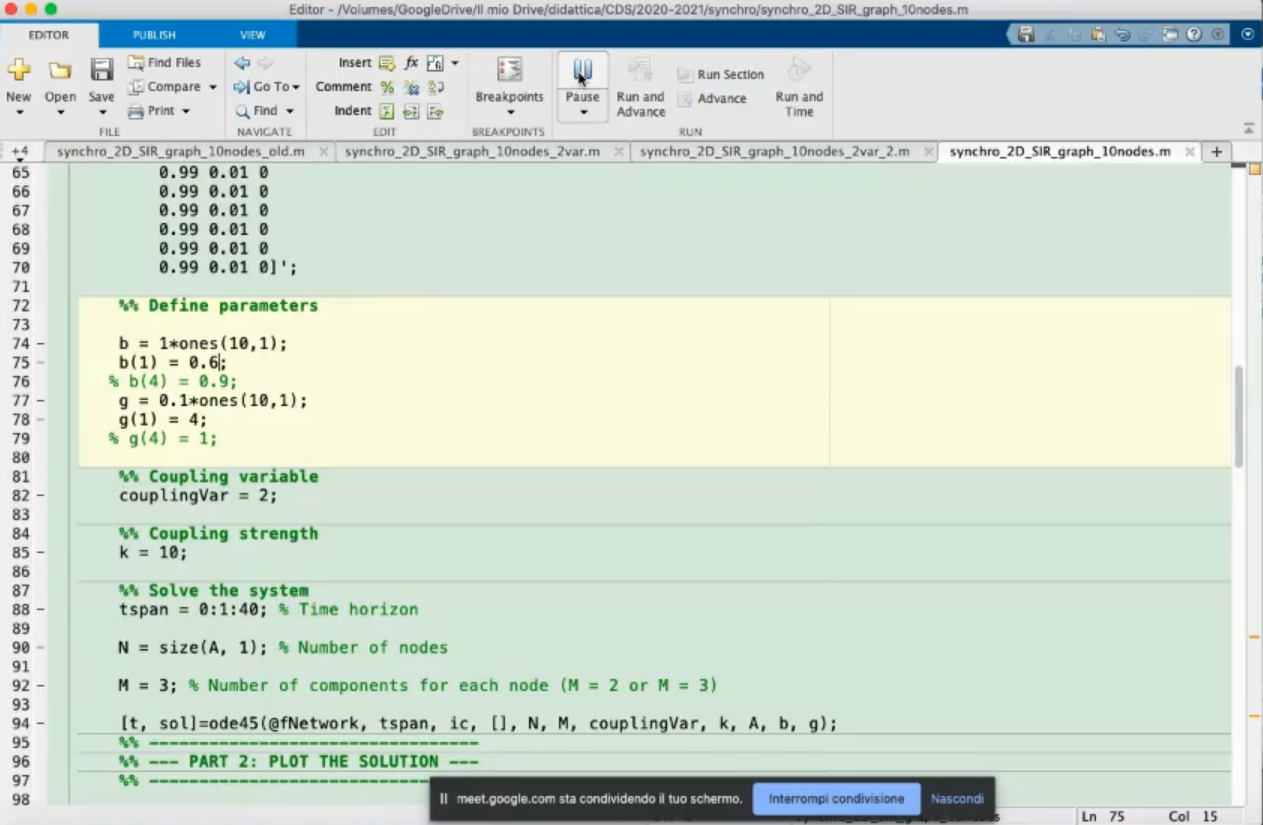
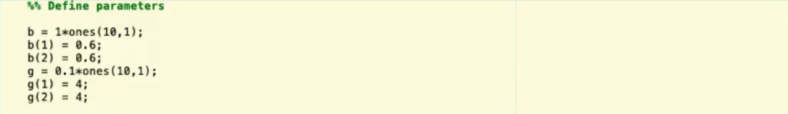
- Define the parameters.
b: parameter β, we set it to 1 for all nodes.g: parameter γ, we set it to 0.1 for all nodes.- For these parameter the γβ>1 so the infections will spread.
coplingVar which variables are coupled, in this case we have choosen to couple the 2nd variable.k: coupling strength, in this case it is 0, so the connections are meaningless.
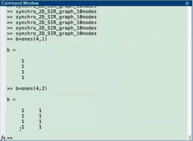
- In the command window we can test and see what the
ones function does.
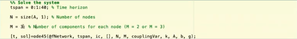
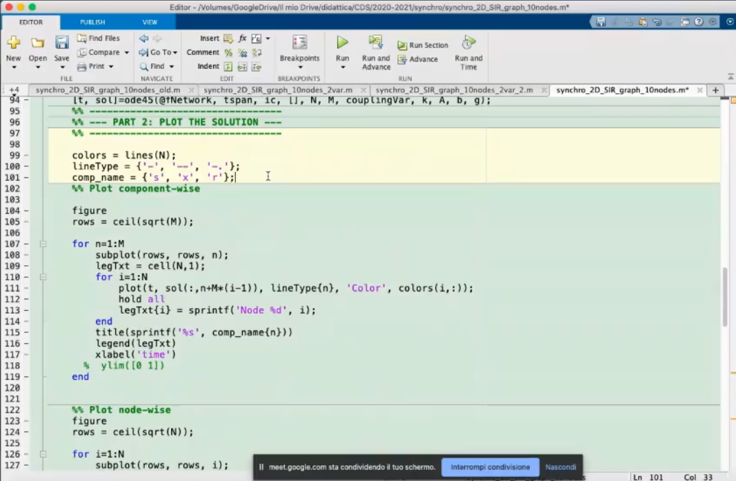
- Solve the system, using the
ode45 function.
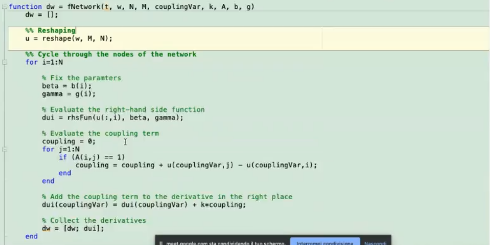
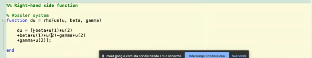
- Here we “explain to matlab” how to connect each node.
u(:,i): initial condition of node i.
- We have added the k (coupling term) in the
fNetwork function, another way could be to define it here, like so:
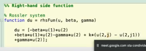
- Choose one of the two methods, not both!
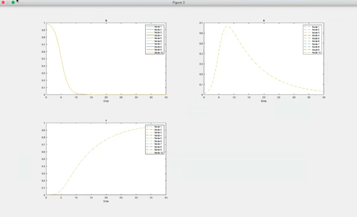
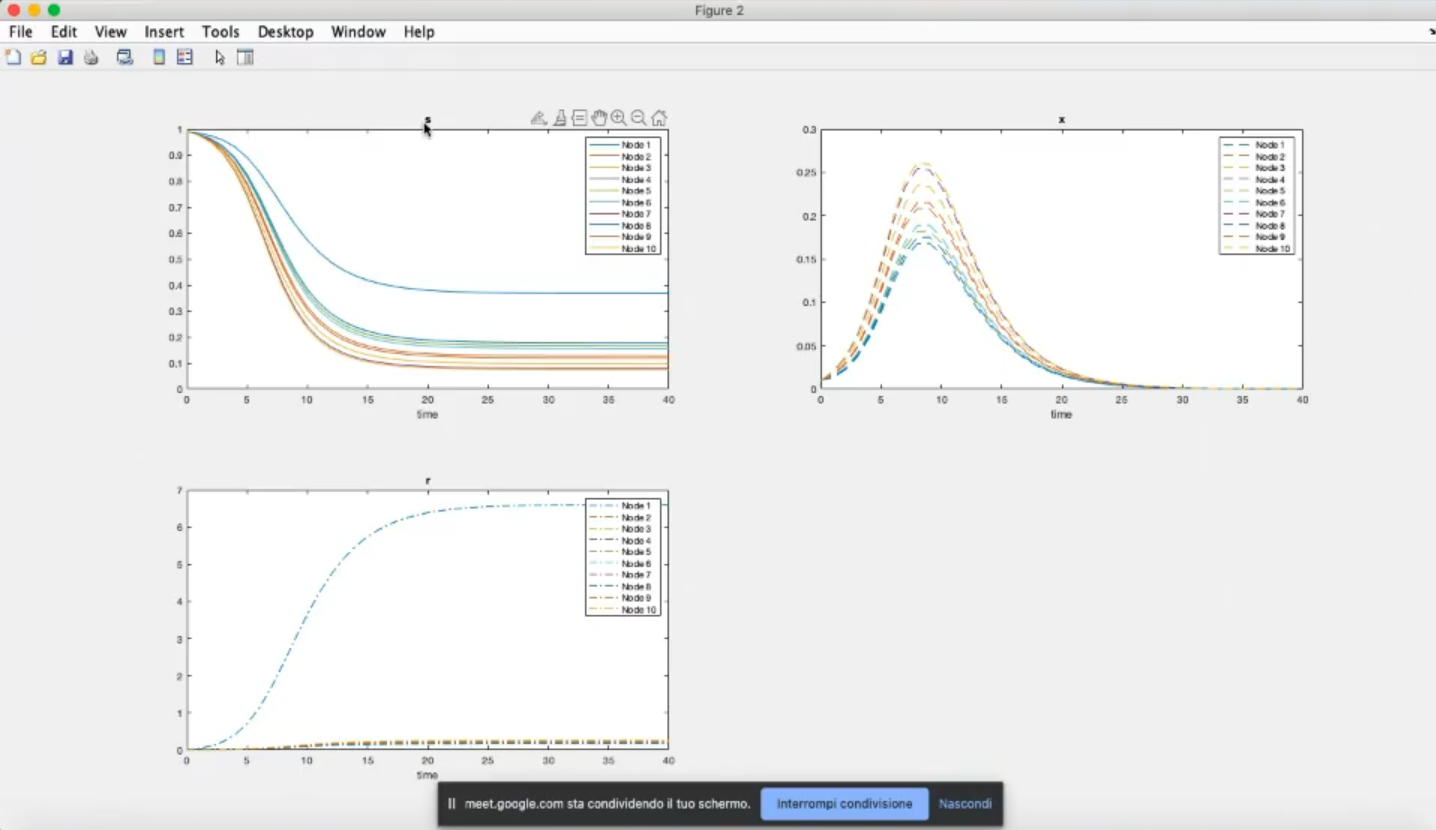
- The subplot one will report all the 1st components for all nodes, we will have 3 sublplots, one for each component.
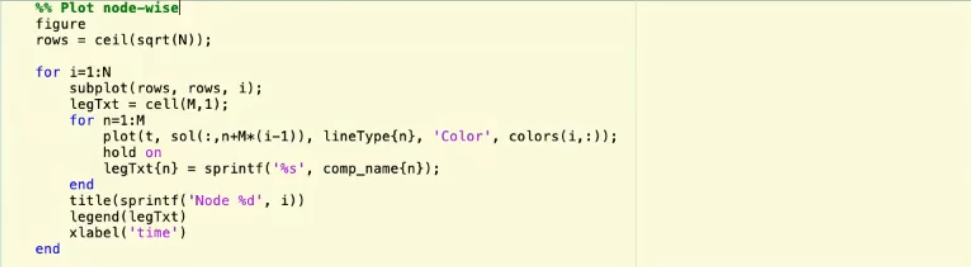
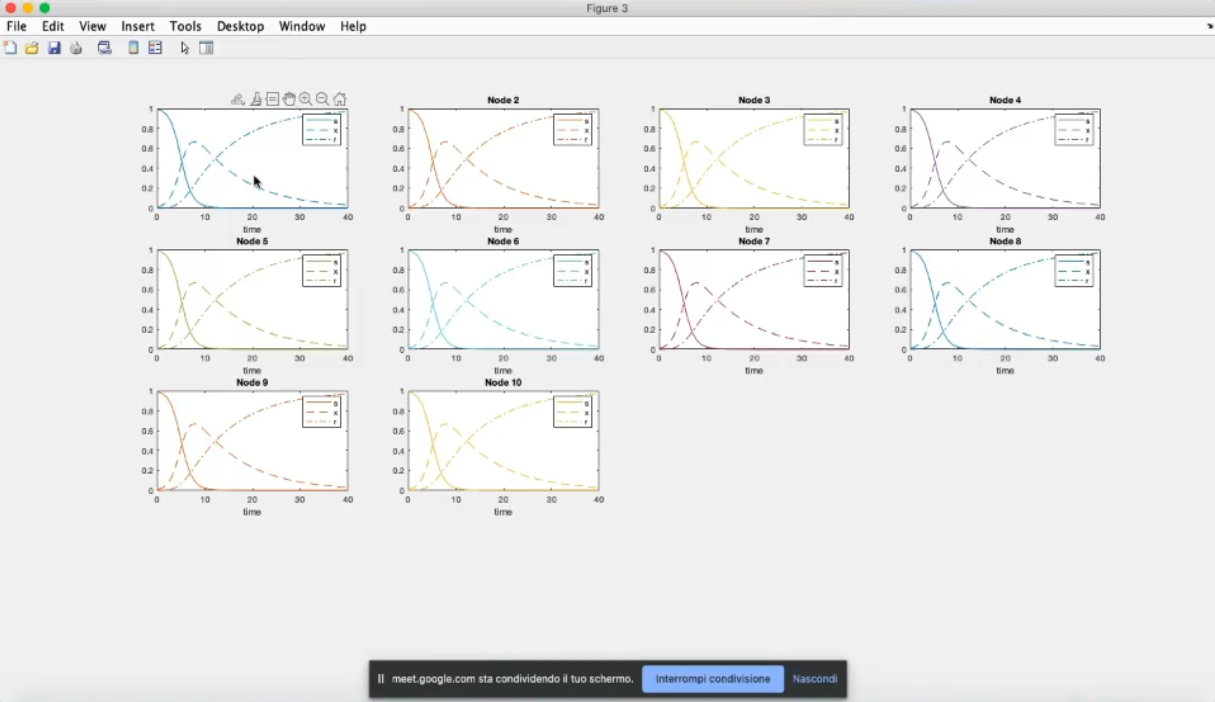
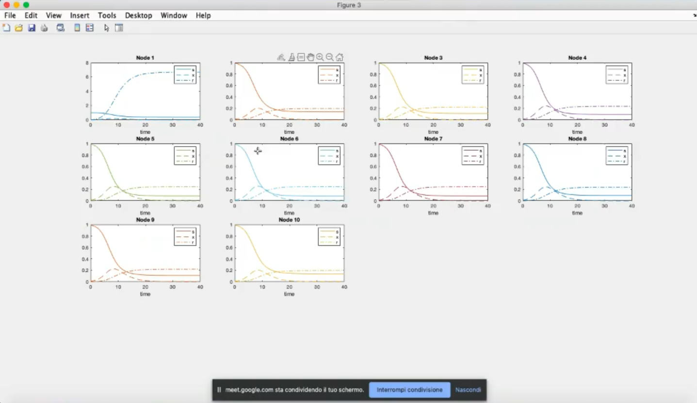
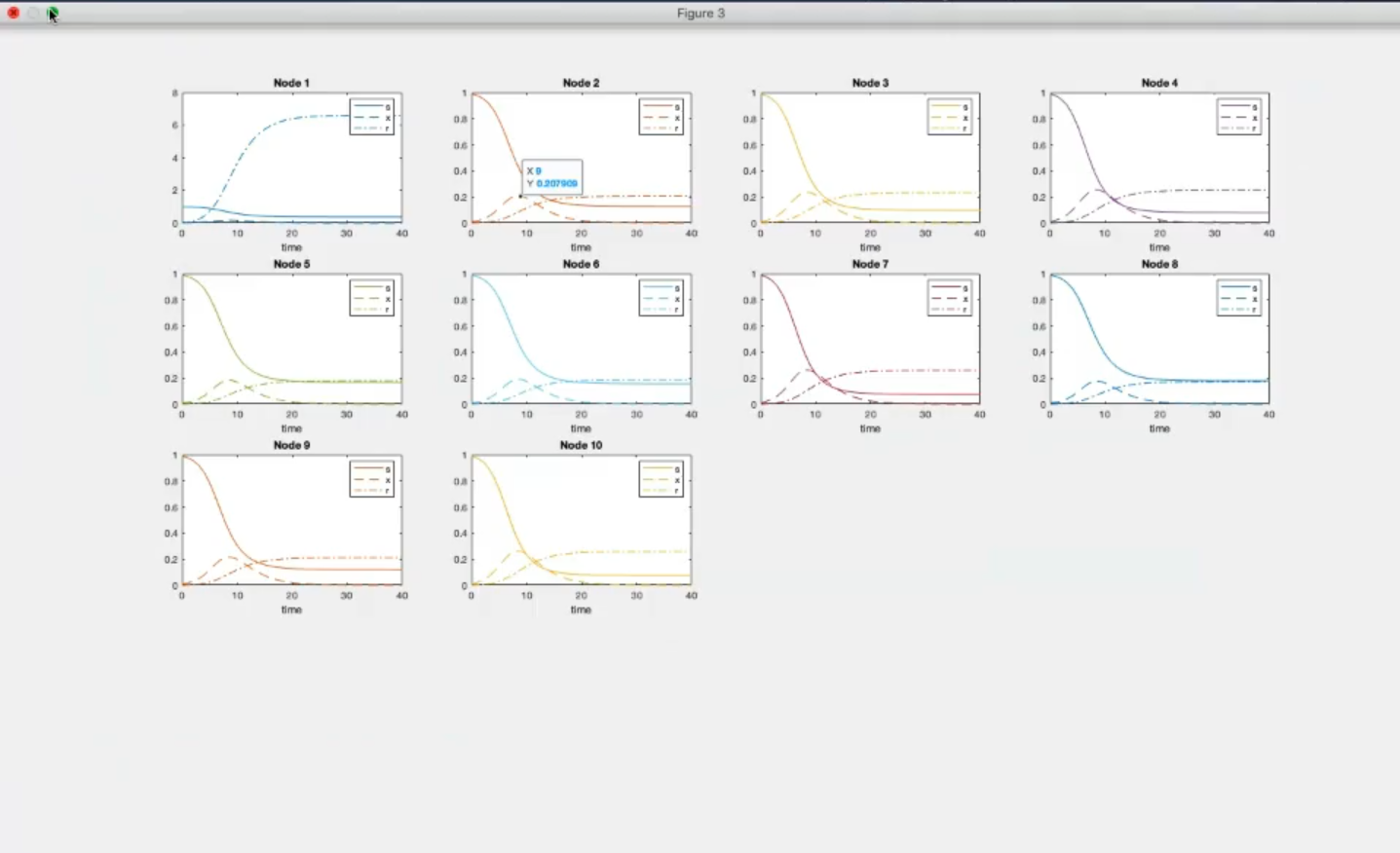
- Each subplot represents all components of one node, so we will have 10 subplots.
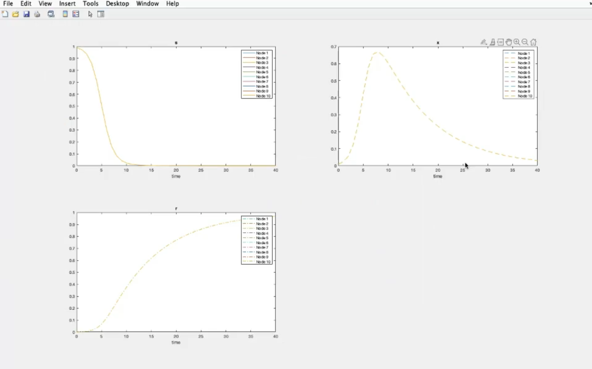
- Component-wise plots (k=0).
- We have also considered the same system and initial conditions for all nodes.
- k=10, however we still have the same system and initial conditions for all nodes.
- Now the first node has a different system, specifically diffrent parameters.
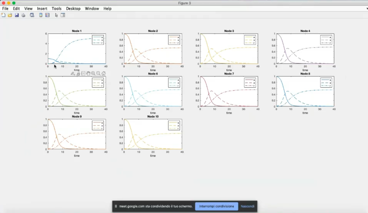
- Node 1 has now a much lower infection, due to the changed parameters (β1=0.9, γ1=1).
- Due to the coupling term (k=10) the other nodes have a decrease in infected people.
- We cannot appreacheate it, but do to the ring strucuture, the further away we move from node 1 the less the inpact of this change will be.
- We change the structure.
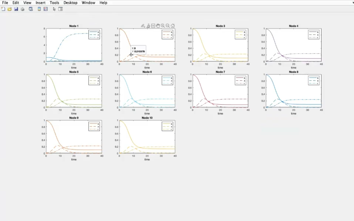
- Recap: k=10, β1=0.6, γ1=4
- Component-wise
- Component 1, node 1: the lowest number of suceptible people become infected (with respect to the other nodes)
- Component 3, node 1: many removed individual (many people recover).
- β2=0.6, γ2=4 (we add another good-behaving node).
- We have choosen node 2, since it is a hub, so it has most number of connections, and so the most impact
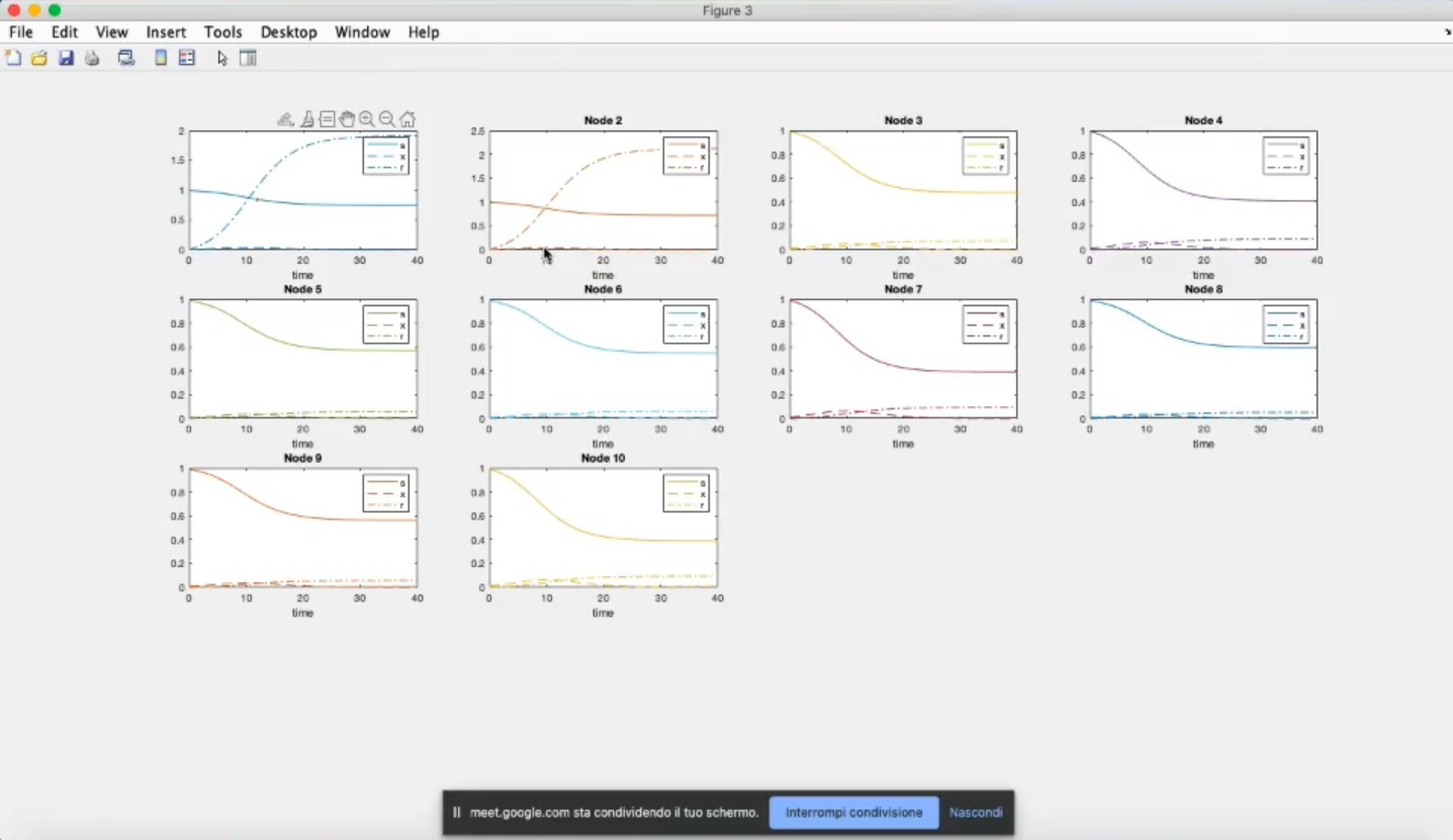
- Now many more susceptible people do not become infected, in general, not only for nodes 1 and 2.
- The effects propagates in the graph.